Explore the updated global Livestock Population Trends dashboard
Latest release presents current FAO data in clear, interactive visualisations
Estimates of livestock populations are hard to find, but this type of data is central for livestock development research, such as economic modelling and forecasting, resource planning, and disease management. As a livestock data initiative, SEBI-Livestock seeks to provide data-driven insights, and livestock populations data is a key part of that.
In 2021, we launched a data tool visualising livestock populations data collected by the Food and Agriculture Organization of the United Nations (FAO). The tool became one of the most viewed assets on livestockdata.org, a website hosted by SEBI-Livestock for the Livestock Data for Decisions (LD4D) network, which underlines the importance of an accessible, visualised version of this data for the wider livestock research and advocacy community.
With this demand comes a responsibility to ensure the information remains current and reliable. We have now integrated the latest data from FAOSTAT, downloaded on June 19th, 2026, to ensure users are working with the most recent evidence available.
Explore the dashboard
How does it help, and who is it for?
This dashboard is designed for policymakers, researchers, and practitioners who need to understand where livestock populations are concentrated and how they are changing, supporting evidence-based planning and resource allocation.
Our researchers rely on this tool to ground their work in robust evidence.
Dr Katie Dirsmith is a researcher on the Insights and Modelling team with SEBI-Livestock, developing models to support livestock decisions. She and her team use FAOSTAT data to inform their internal economic models: "While static spreadsheets can be very informative, data dashboards like this one provide a more user-friendly interface. The dashboard format allows the user to quickly visualise livestock population trends over time within a country. Access to a tool like this will greatly facilitate my work as a researcher.”
For Dr Rose Ikwu, a research assistant on the same team, dynamic data sources can increase efficiency: “What I appreciate most is how quickly it gets me from a question to a reliable answer: instead of working through written reports and tables to locate a handful of data points, I can filter for the parameters I'm interested in and see comparisons and trends immediately. The dashboard turns a process that is usually a slow, manual task into something close to instant, and it is simply brilliant for our work.”
By transforming complex datasets into interactive visuals, we aim to bridge the gap between raw data and actionable insight.
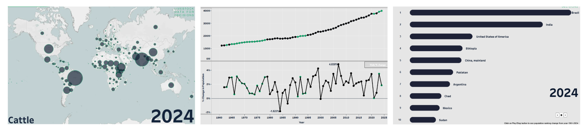
Example data visualisations from the Livestock Population Trends dashboard. Image 1 shows 2024 distribution of cattle populations worldwide; image 2 shows the annual percentage change of the cattle population in Africa from 1962-2024; image 3 shows the top 10 leading countries for cattle in 2024.
What does the dashboard offer?
The updated viz retains the core features that users have found most valuable, organised across six intuitive tabs.
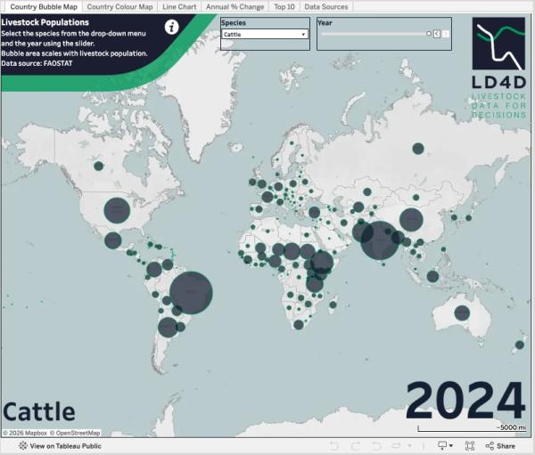
The Country Bubble and Colour Maps provide a global overview, allowing users to see which nations host specific livestock populations and how these distributions shift over time. Bubble areas and shading intensity scale directly with population counts, offering an immediate visual sense of magnitude.
The Line Chart and Annual % Change tabs drill into the trends behind the numbers, enabling users to explore population trajectories within specific countries or regions. These views include critical metadata flags, distinguishing between official figures and estimated values.
The Top 10 tab features an animated bar chart race, illustrating how the leading countries for each species have changed position through the years.
Finally, the Data Sources tab ensures users can interpret findings with context, including notes on methods and data limitations from the data provider.
Behind the data: more than a routine update
Our team has been closely monitoring the data itself, as it actively informs our internal dashboards and models for the Gates Foundation.
During the processing of this update, we observed notable changes in values and source flags across existing data points – for example, some historical figures have been revised, while others have shifted from official submissions to imputed estimates. These revisions highlight underlying data uncertainty, particularly in the low-income regions where we work, and where precise population counts drive critical policy decisions. We intend to explore these variations further to understand their impact on modelling and decision-making.
This dashboard update reinforces our commitment to providing findable, accessible, and reusable data tools. We know that evidence is only useful if it can be interrogated and understood. By maintaining this dashboard, we hope to support stronger livestock development strategies across sub-Saharan Africa and beyond.
Tell us what you need
We welcome feedback from the community. If you use this dashboard to guide action, let us know how it fits into your workflow and where improvements could be made. Your insights will help shape the next generation of tools for livestock evidence. Please contact SEBI-Livestock with your suggestions.